
bezahl.de - The logo and its origin
- May 3, 2022
- 2 min read
Logos, the well-known trademarks, the sight of which one immediately associates with a certain product or certain properties. But how well known is the story behind the unique symbols? Our logo also has an interesting history, which of course we don't want to withhold from you.

Interplay of product and design
The story began with the final product orientation in mid-2019. After the early development and finding phase, bezahl.de became the product that has now become the standard in the automotive trade: an all-in-one platform for digital payment management. All internal processes from the payment request through processing to posting can now be mapped reliably and efficiently with bezahl.de.
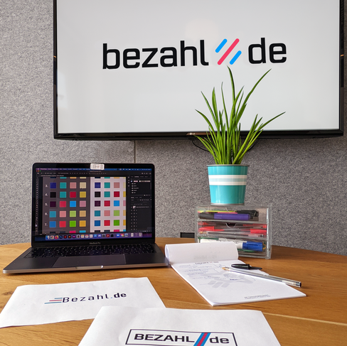
In the course of further product development, the design was also revised. But developing a new design doesn't happen overnight. 133 designs, 21 colors, 17 fonts and half a year of development later, it was done: The logo is final. bezahl.de is not only the URL of the platform, but also the product name and the logo.
“Creating the logo was an intense time as we grew as a team and paved the way for the future of the brand. With a result that is impressive!” says the lead UX and graphic designer at NX Technologies.
Logo insider knowledge
The claim "Process rocket for the car trade" can be found in the bezahl.de logo. The three lines in the middle of the logo show the process rocket typical of bezahl.de. In this context, the color blue (Azure Radiance) stands for security and is characteristic of the banking and financial world. The red flamingo as the second main color is intended to convey the dynamism and competitiveness of the brand. Everything is united under the motto: Expert, agile and cooperative.


Comments